Internal / Product Team — 2024
Design System
A business-oriented design system optimized for the Japanese market — typography, components, and documentation built for real product teams.
- Role
- Design System Lead
- Client
- Internal / Product Team
- Year
- 2024
- Services
- Design System, Tokens, Documentation, Figma
This is a demo of a business-oriented design system optimized for the Japanese market, where I am in charge of Japanese Localization, Design Tokens, Responsive design guidelines, Component Design, and Usability tests.
Project Affiliation: Hays Japan
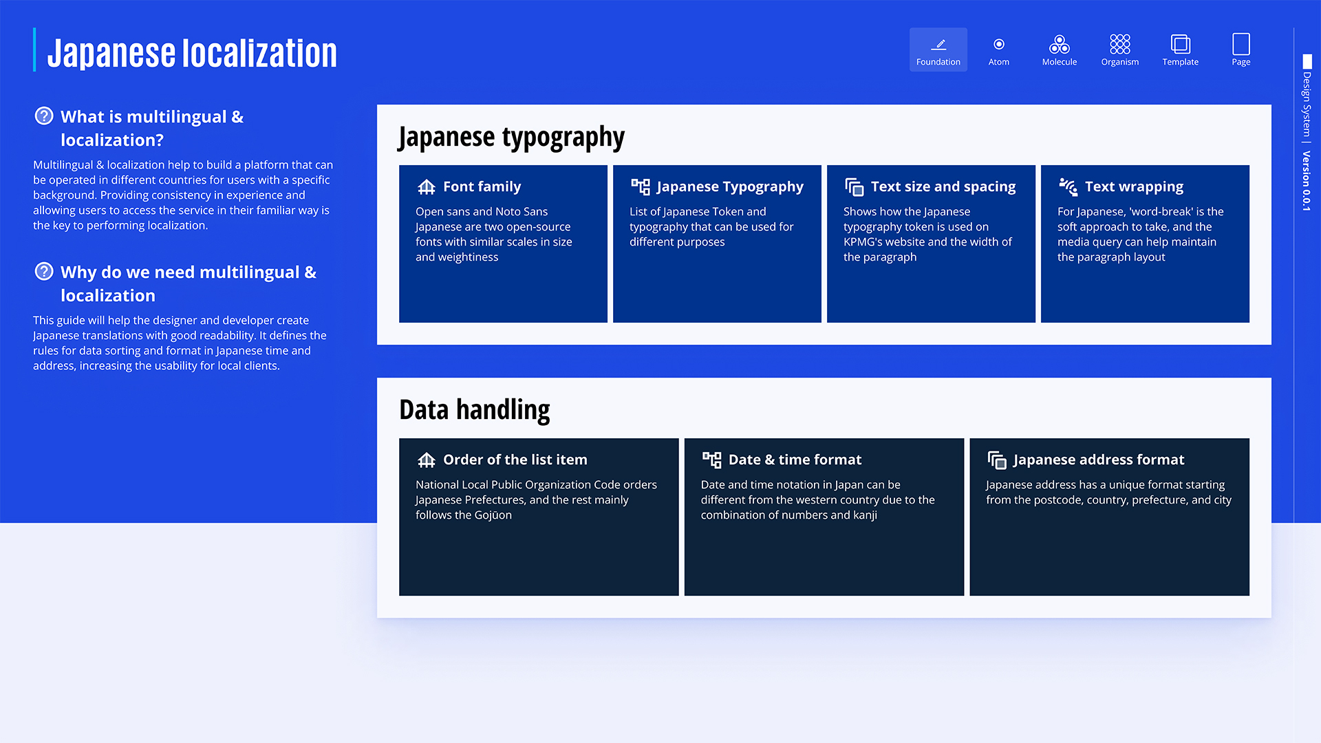
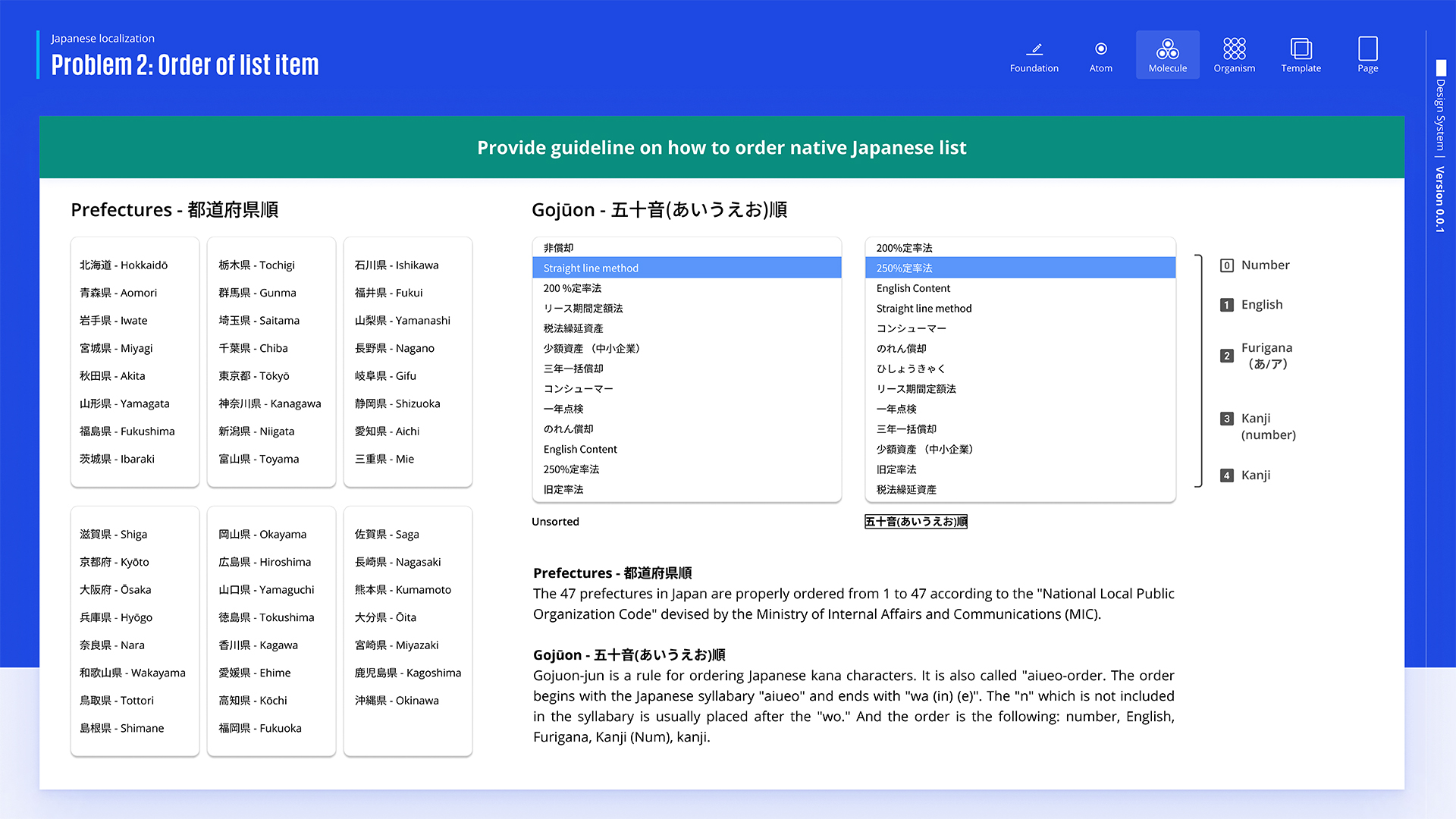
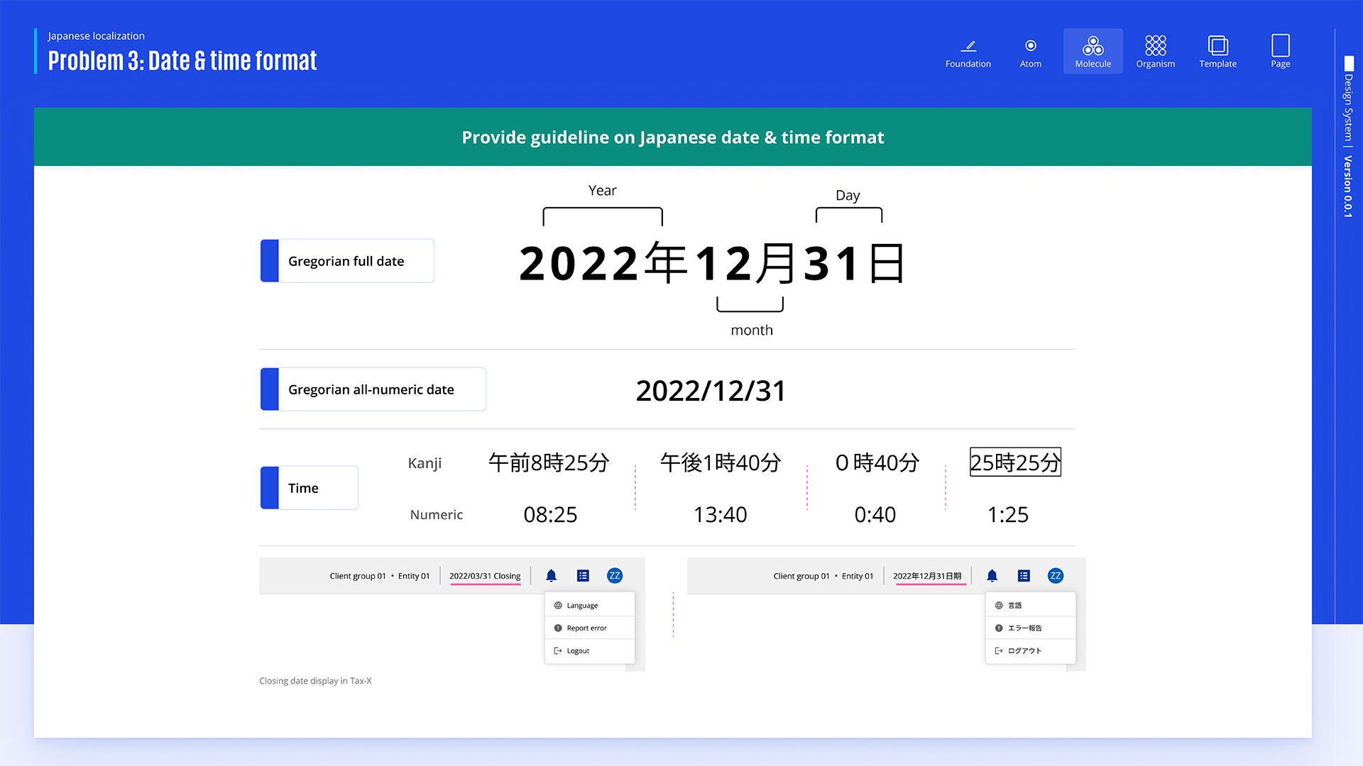
The USP of this design system is that Japanese localization suggests using fonts like Open Sans and Noto Sans Japanese, with proper text size, spacing, and word wrapping for readability. It also highlights the importance of following Japan’s unique date, time, and address formats and the correct order for Japanese prefectures. The goal is to improve usability by adapting designs to fit local standards.
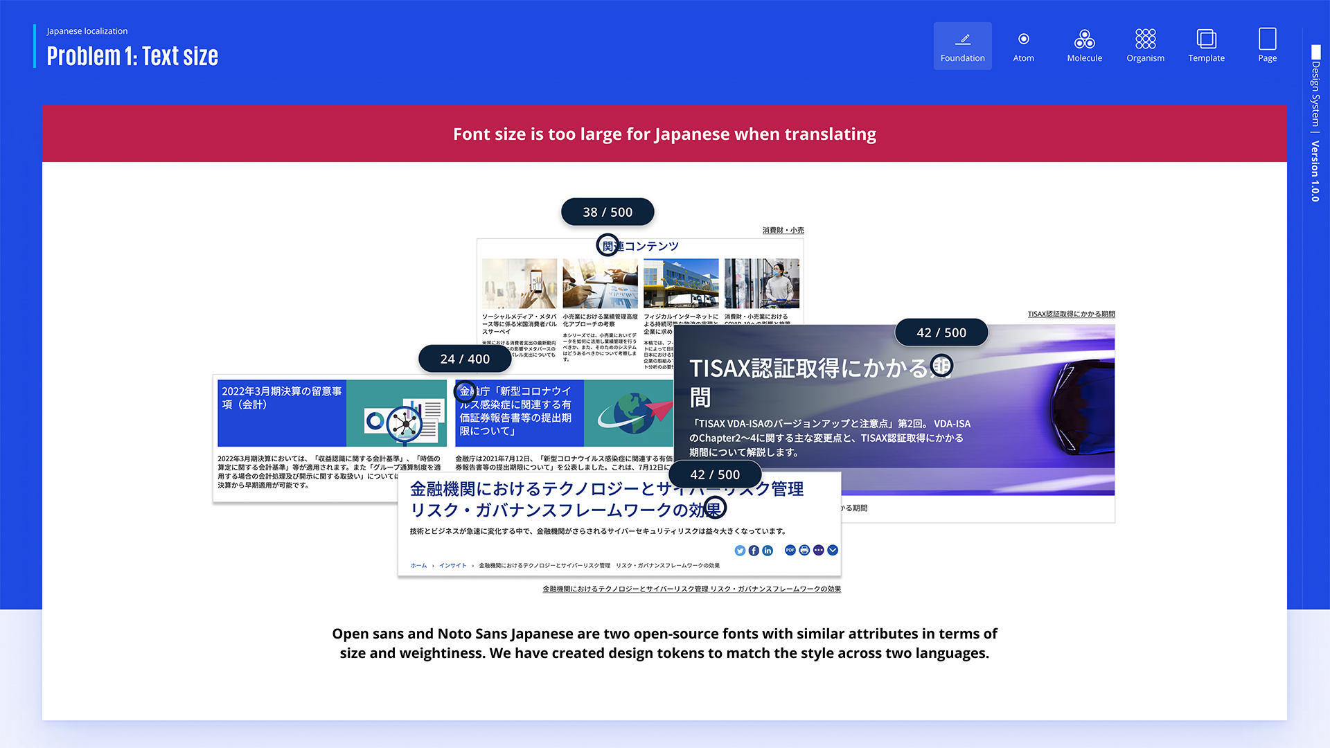
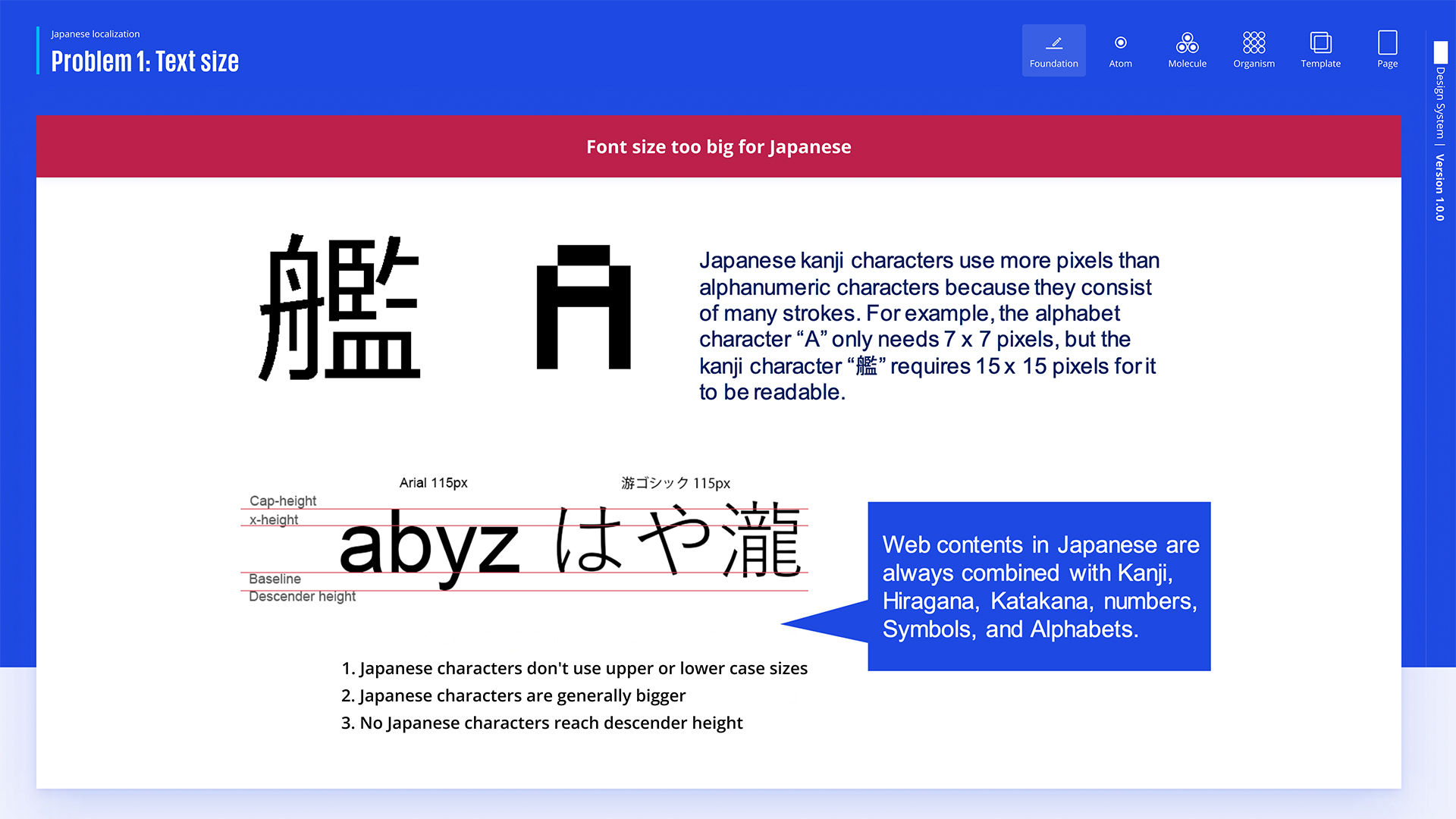
The first problem with text size in Japanese localization is that when translating English to Japanese, the font style applied to the page is too large for Japanese characters, leading to poor readability and layout issues.
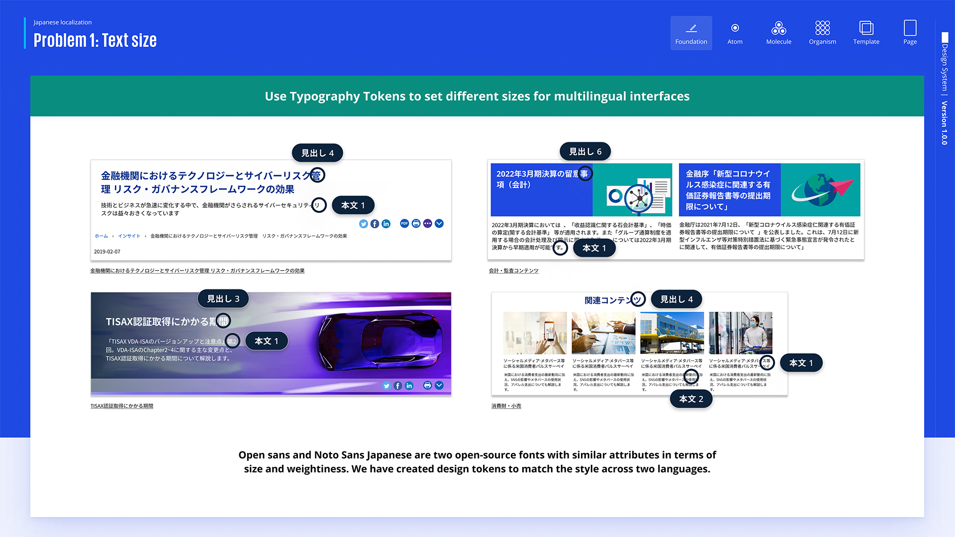
The solution to the text size issue is to use typography tokens, which ensure appropriate font sizes and consistent styling across different text elements for better readability in Japanese.
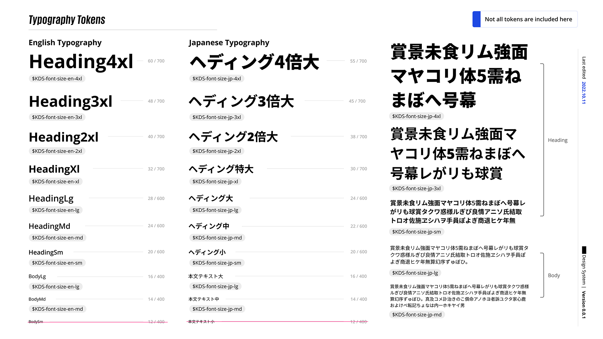
The slide compares English and Japanese typography tokens for various heading and body text sizes, demonstrating the consistent application of design tokens across both languages. Additionally, we have removed font sizes under 14 for improved readabil ity.
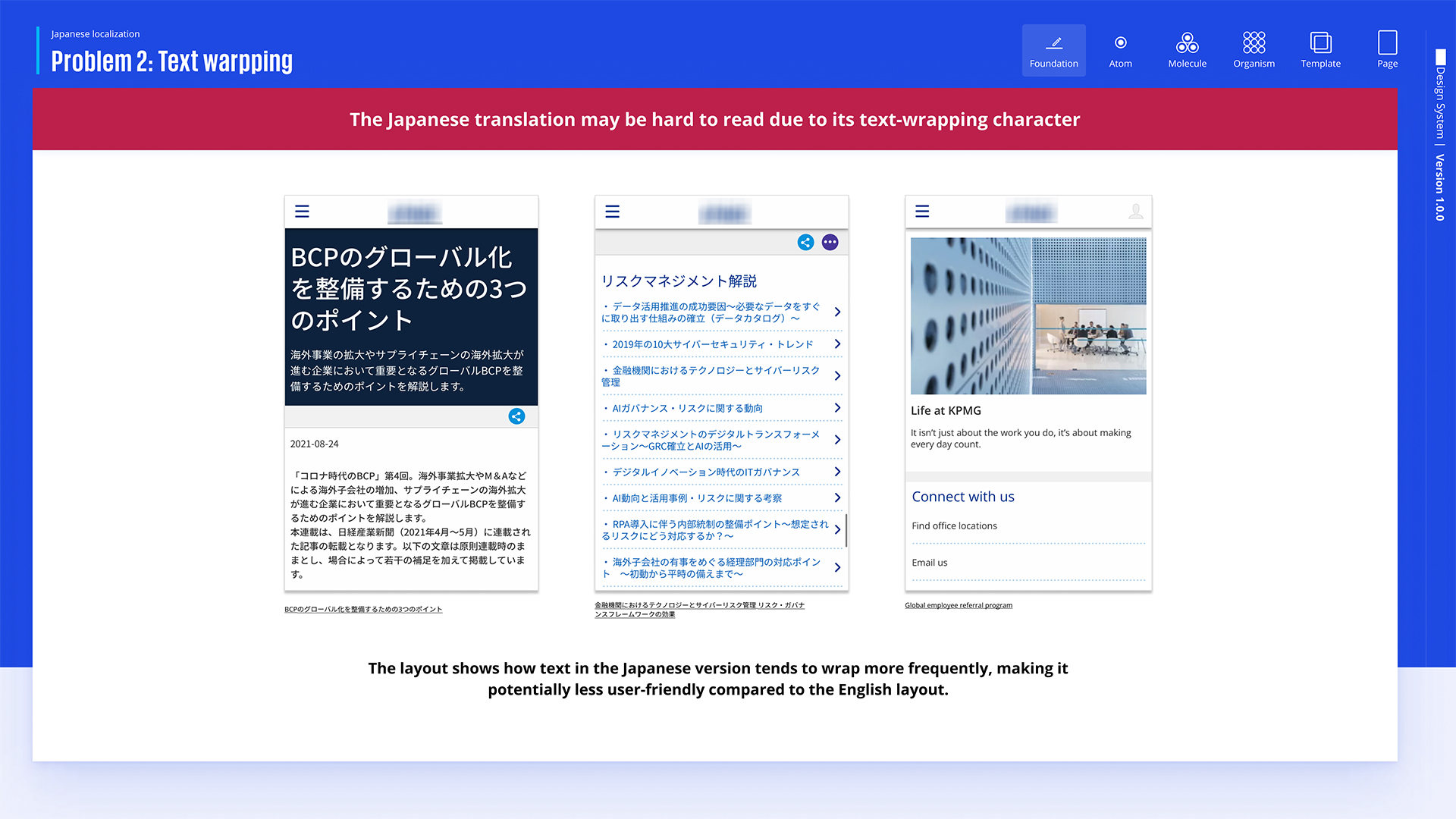
The Japanese text wraps more frequently than English and often splits a single word, making the layout harder to read and less user-friendly.
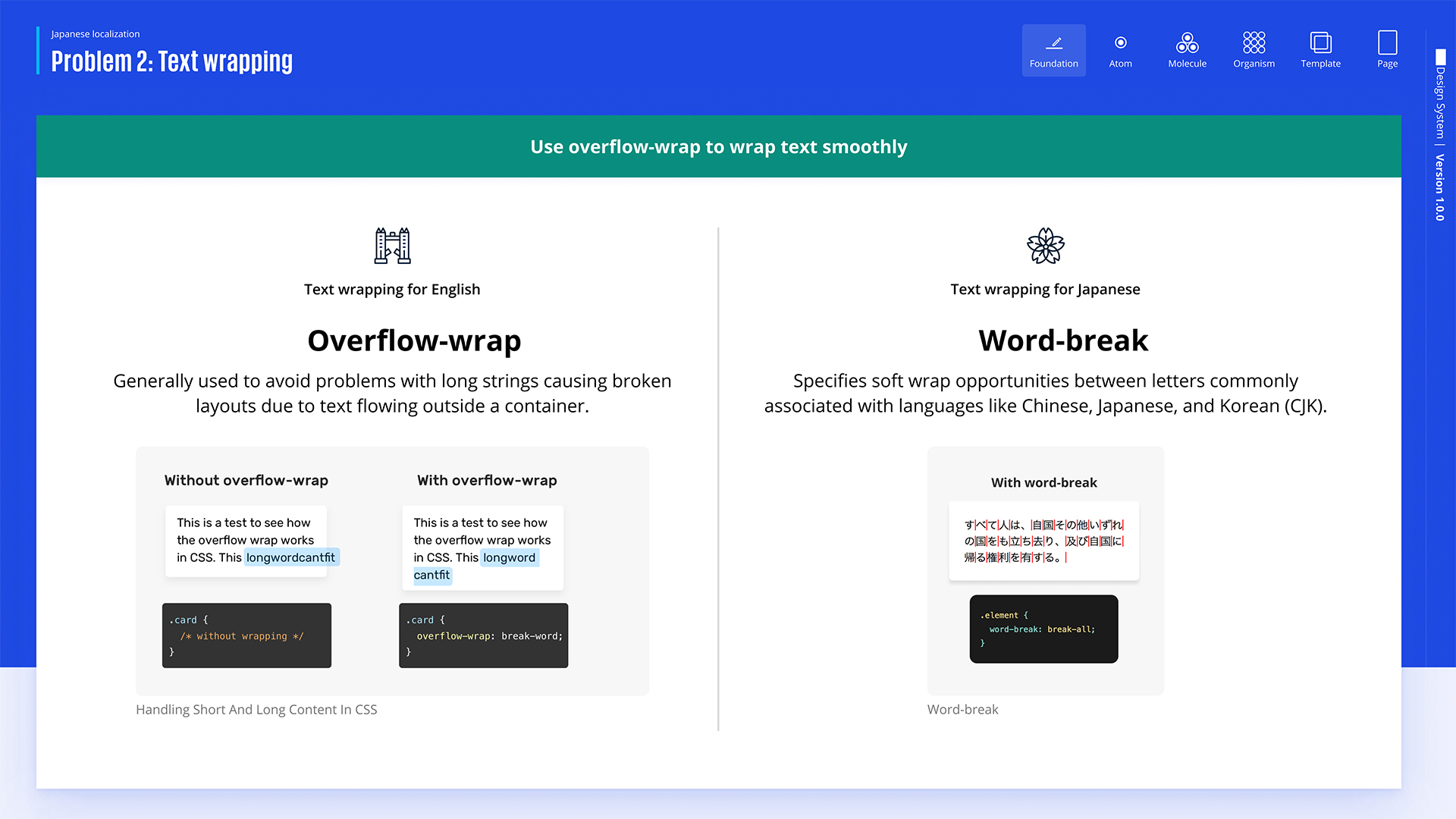
The issue of text splitting in the middle is addressed by using overflow-wrap for Japanese, preventing broken layouts caused by long strings, and word-break for English, which provides soft wrap opportunities for smoother text flow in languages like Chinese, Japanese, and Korean (CJK).
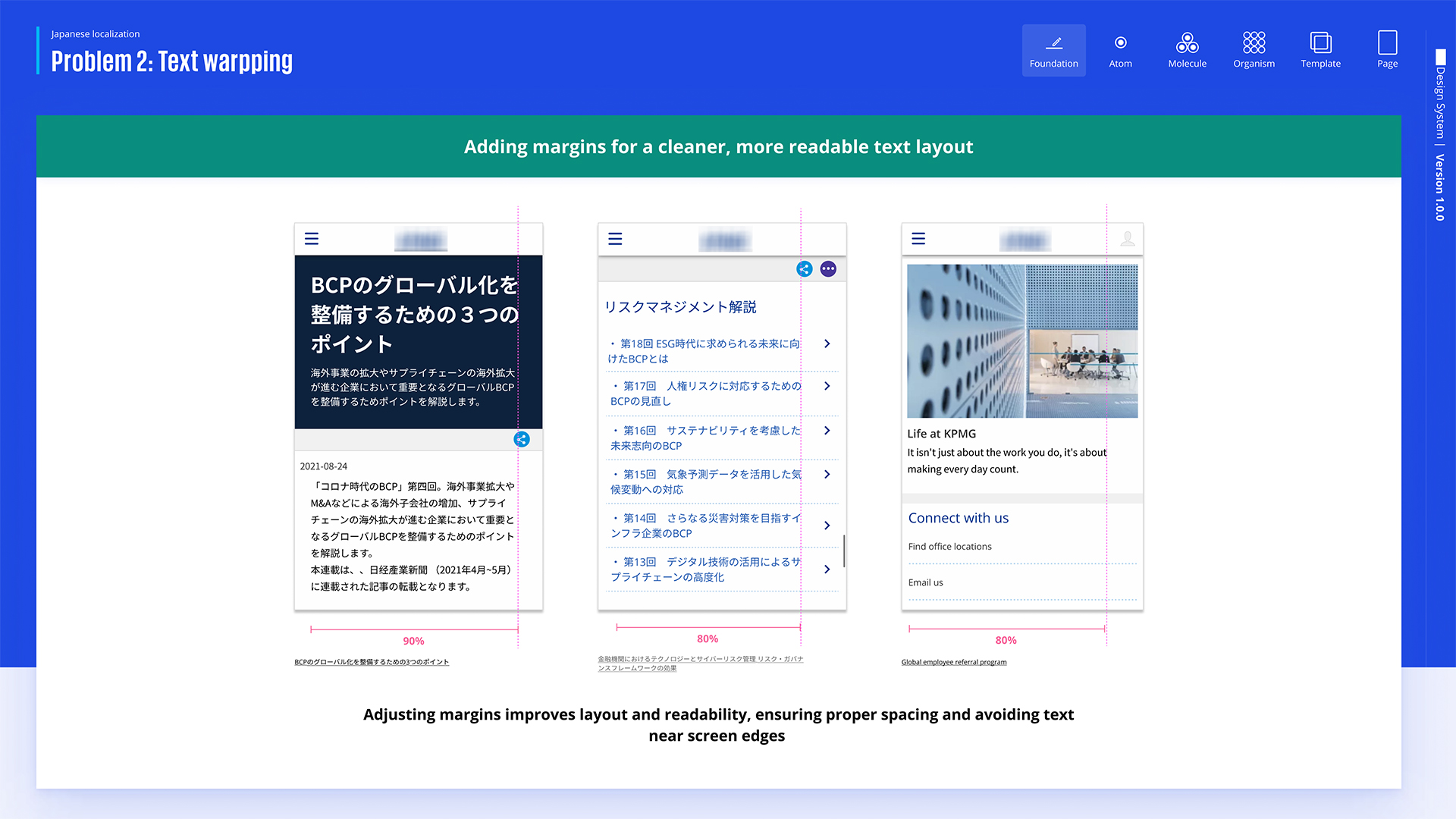
The future solution would be using media queries to manage text wrapping across different screen sizes, ensuring that word breaks are pre-defined based on the viewport to maintain a consistent layout on various devices.
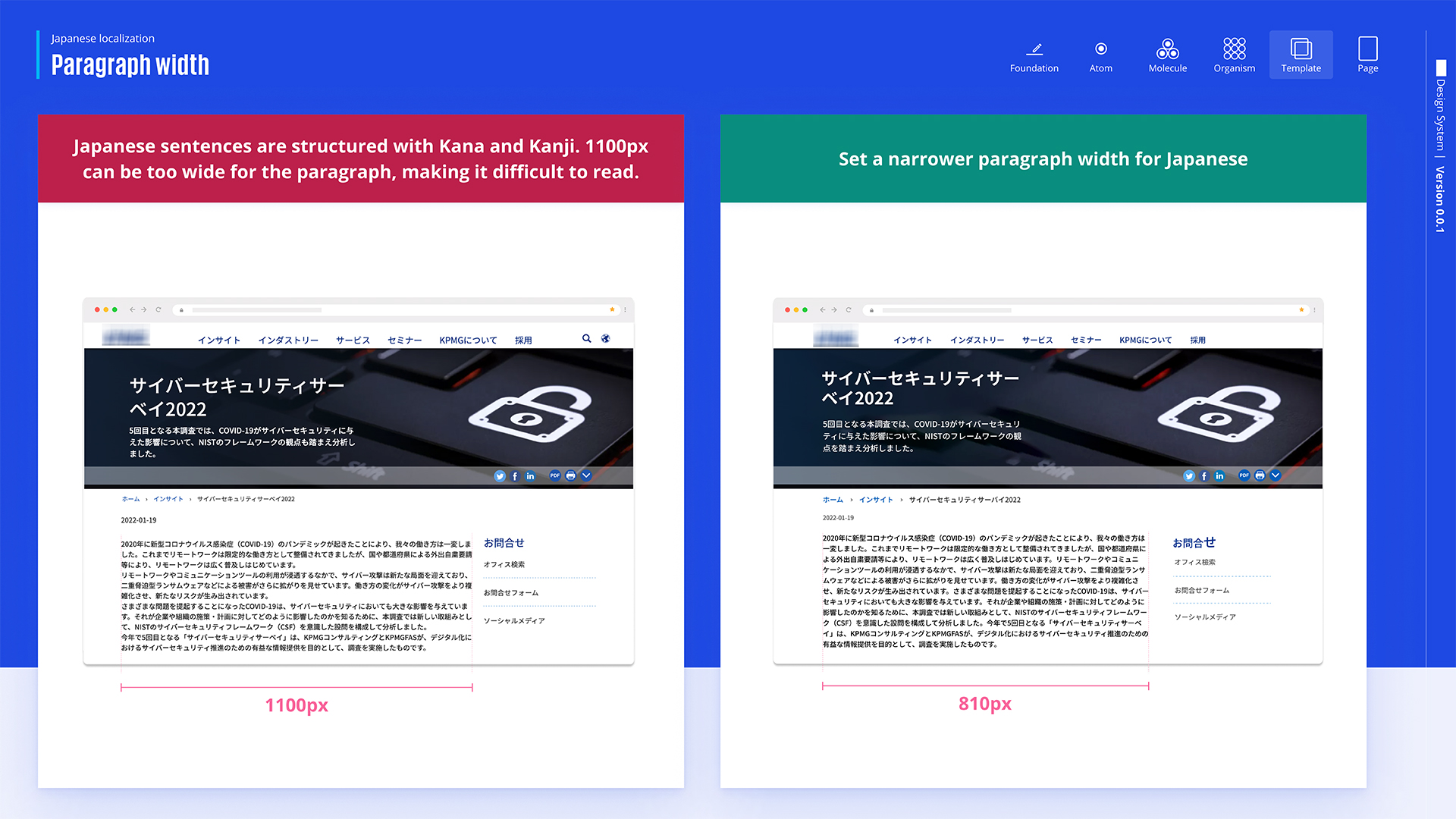
Since Japanese sentences are composed of Kana and Kanji, they can be challenging to read when the paragraph width is too wide, such as 1100px. The recommended solution is to use a narrower width, like 810px, to improve readability. This adjustment makes the text easier to follow, ensuring a better reading experience in Japanese.
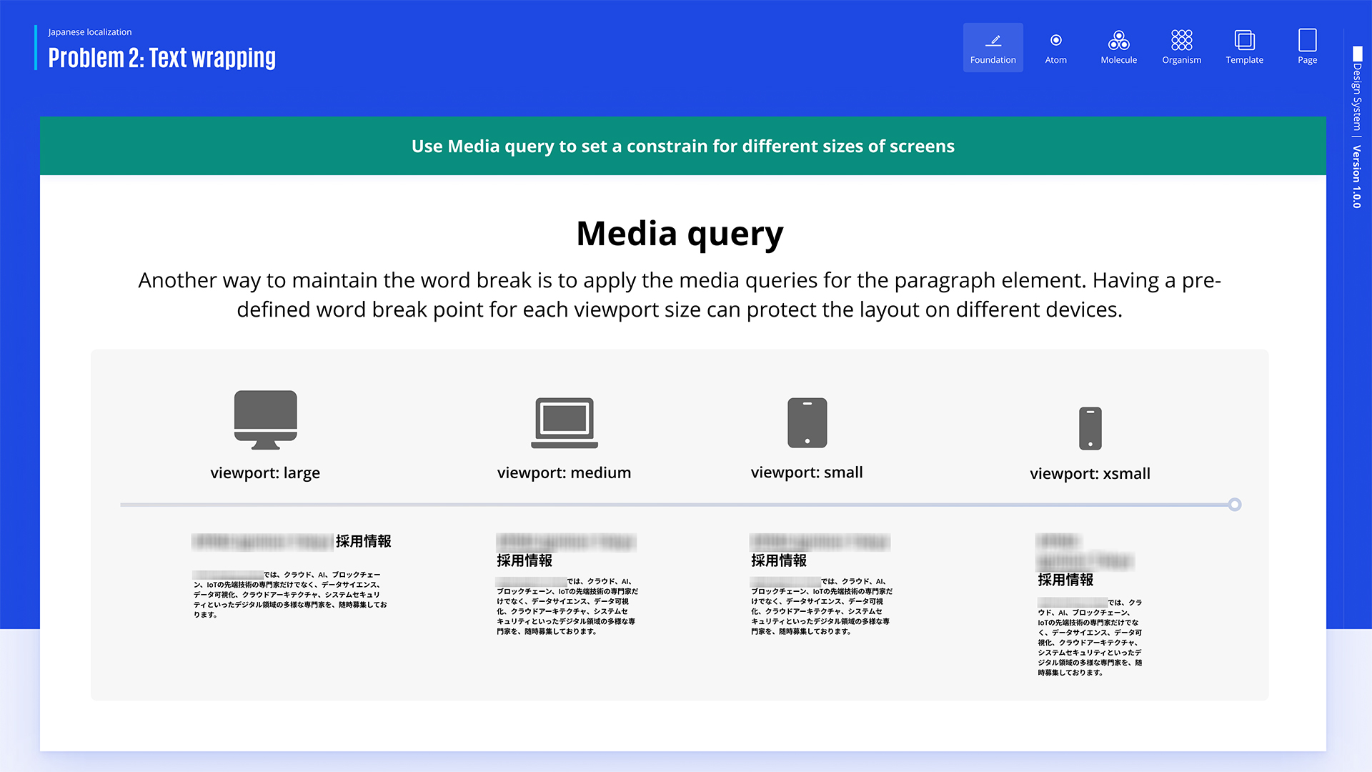
Another future solution we have proposed is adjusting margins, which will make the layout cleaner and the text more readable while ensuring proper spacing and preventing text from being too close to the screen edges.
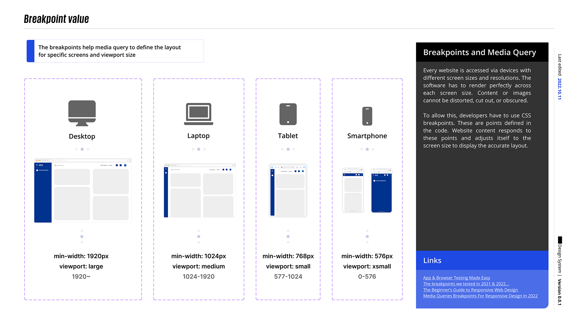
Setting these breakpoints enables the Media Query to adapt efficiently; we have decided on a range of breakpoints to trigger different layouts on various screen sizes.
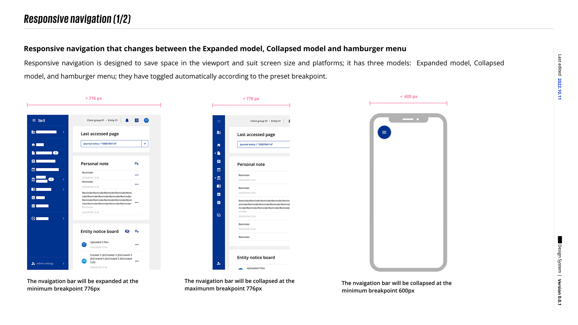
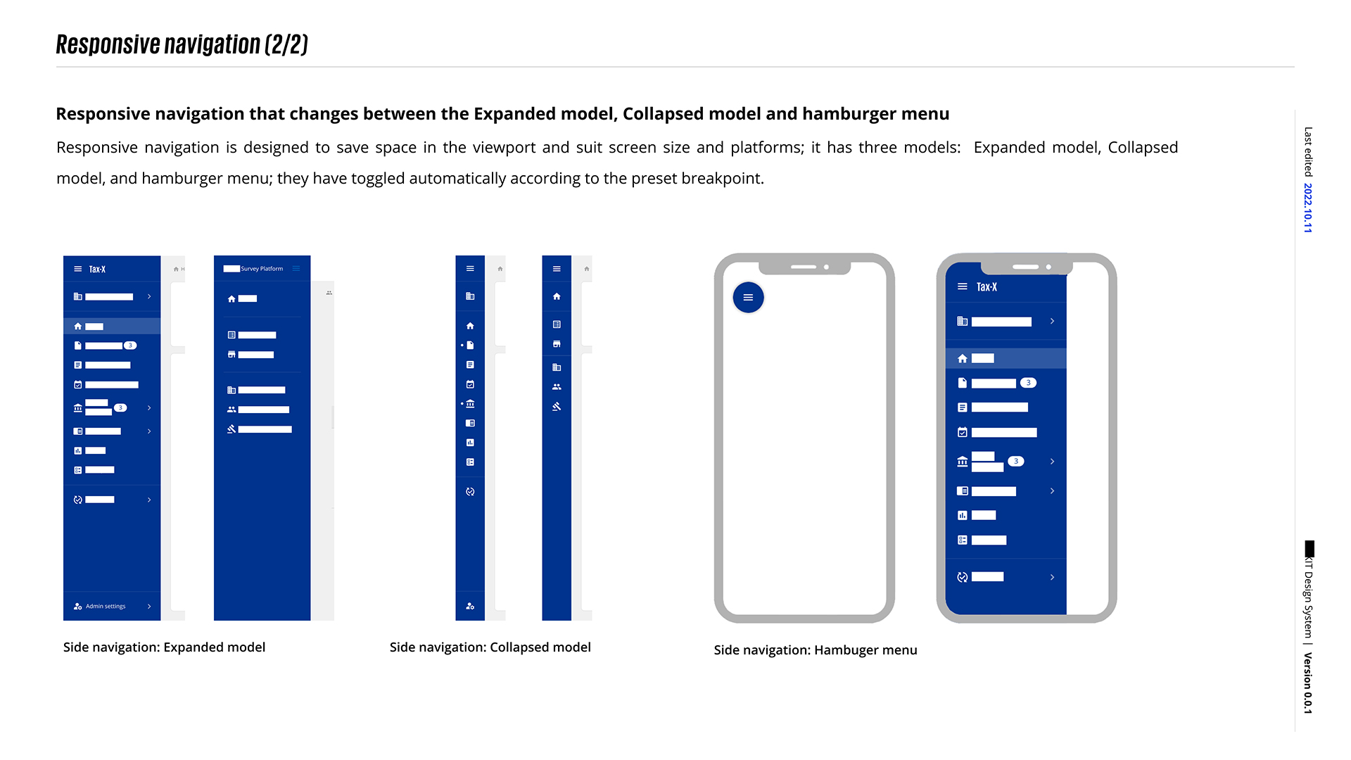
By establishing a Media Query, we can design a separate state for different screen sizes. To save space, in this version, we designed the collapse specification for the navigation bar and implemented it in the Tax-related application.
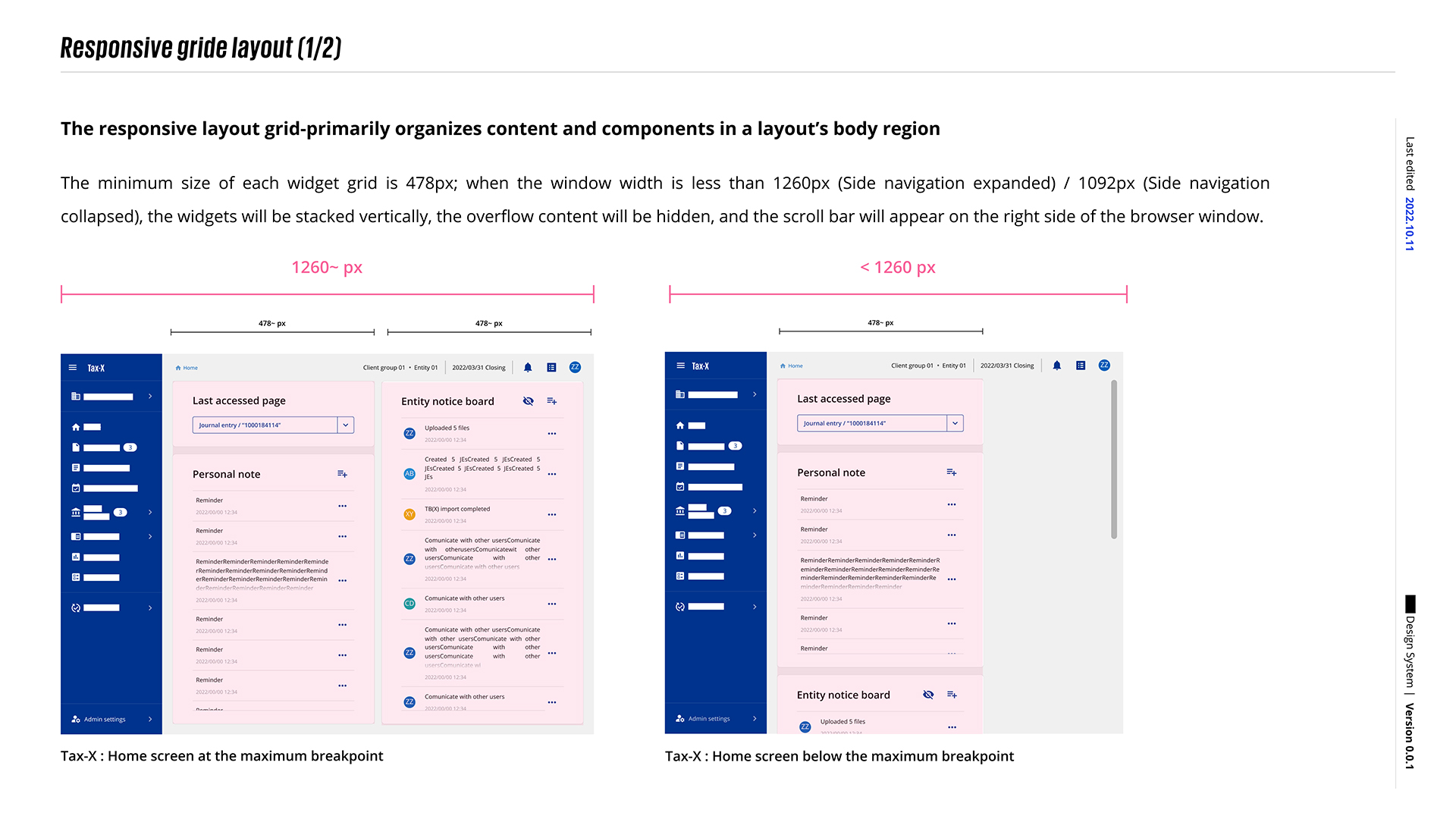
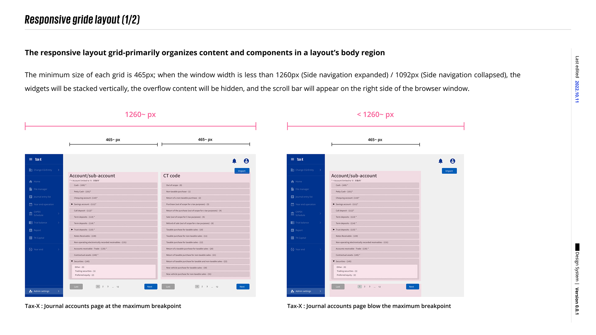
In this version, we also worked with the development team to implement component wrapping. When the browser size triggers the media query, we can wrap the components. We believe this is a significant improvement over past business applications.
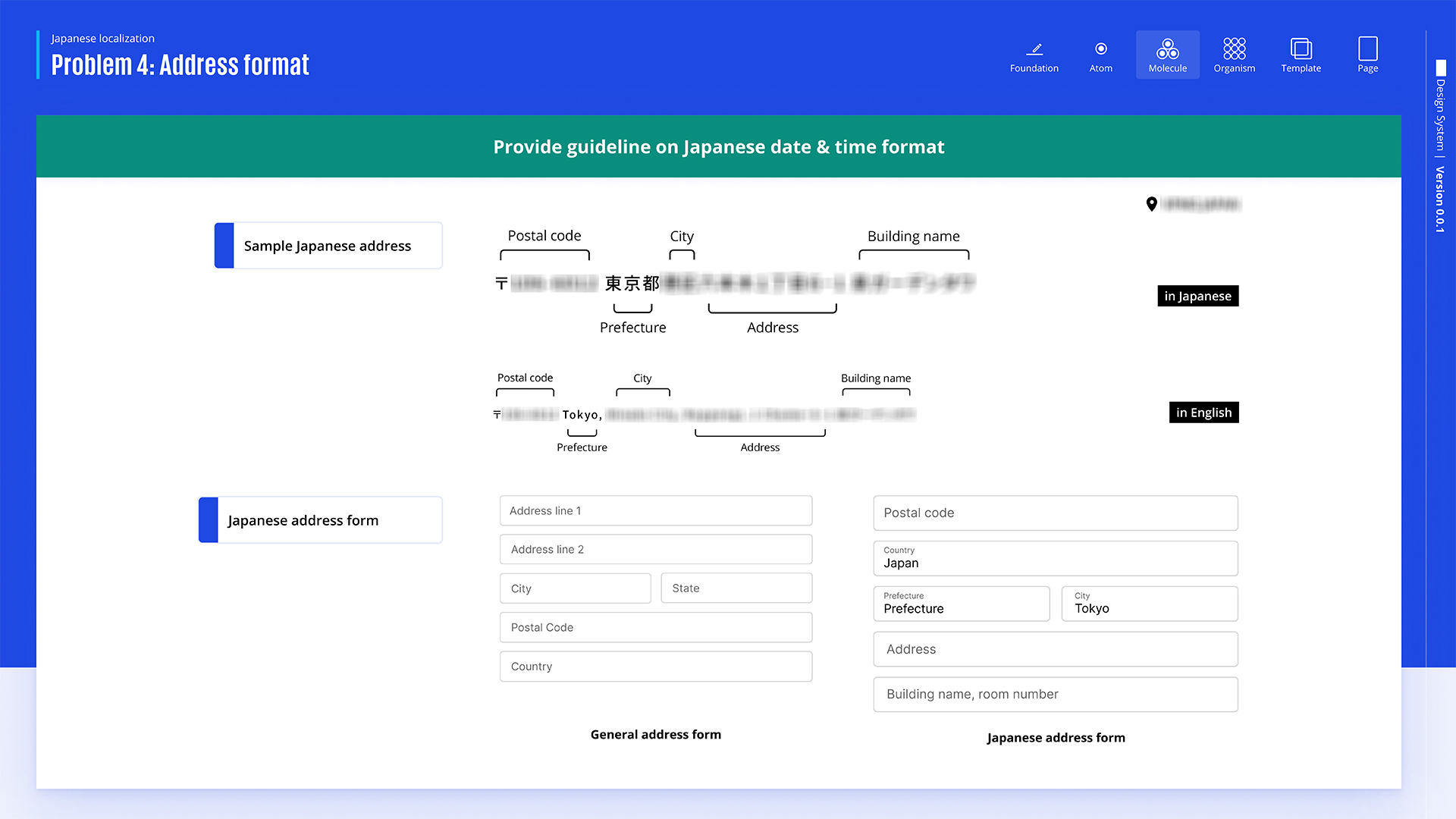
On the other hand, addresses in Japan are typically written starting from the postal code, followed by the prefecture, city, district, and then the specific building name and number. The order is reversed in English, where addresses begin with smaller details (like buildings and streets) and end with the city and country. The image also compares how a form layout should adjust to fit these different address formats, emphasizing the need for localization when designing address input forms for global users.
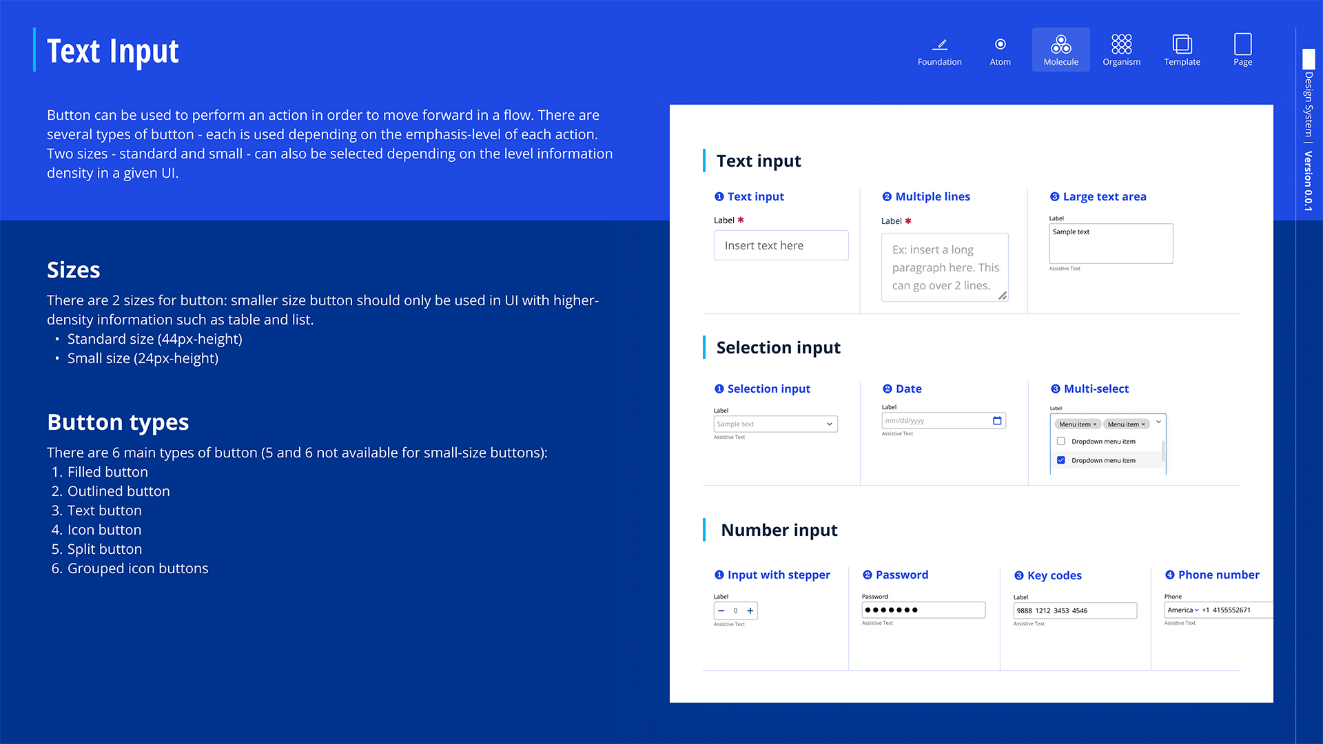
The design system contains various components, such as text and selection inputs, along with button sizes and types, including standard and small sizes based on UI needs. Its main purpose is to align with the brand image and meet business requirements.
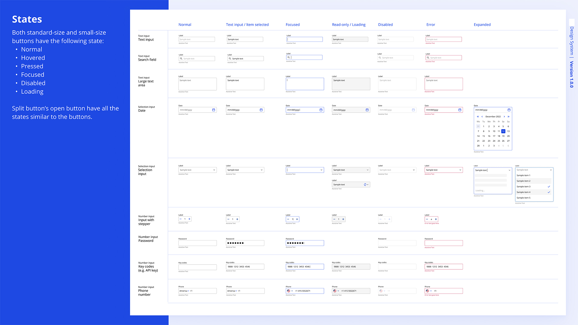
Both standard-size and small-size buttons feature the following states: Normal, Hovered, Pressed, Focused, Disabled, and Loading. Additionally, the open button of the split button includes all the same states as the regular buttons.
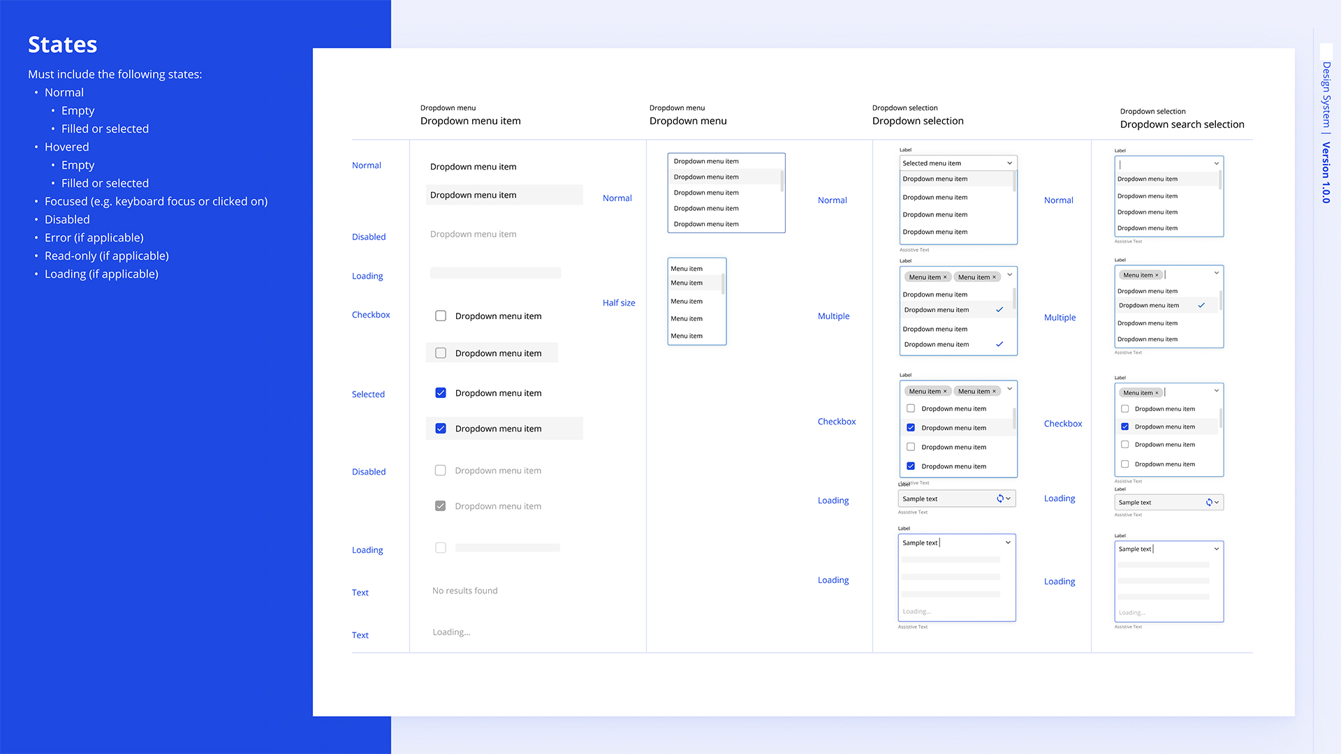
The dropdown component also has detailed states like normal, hovered, focused, disabled, loading, and selected. It includes single-selection, multiple-selection, checkbox, and searchable dropdowns, ensuring clear interactions for various use cases, such as selecting items or searching within options.
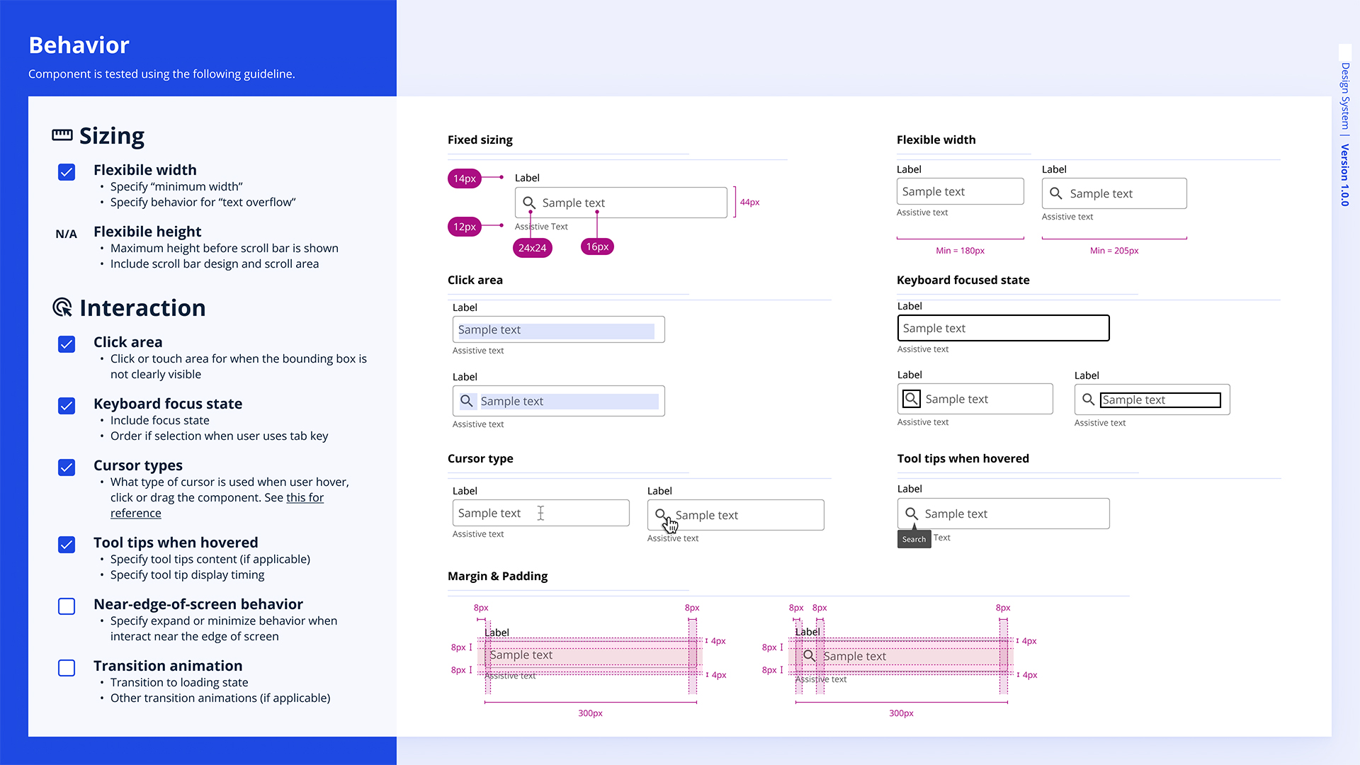
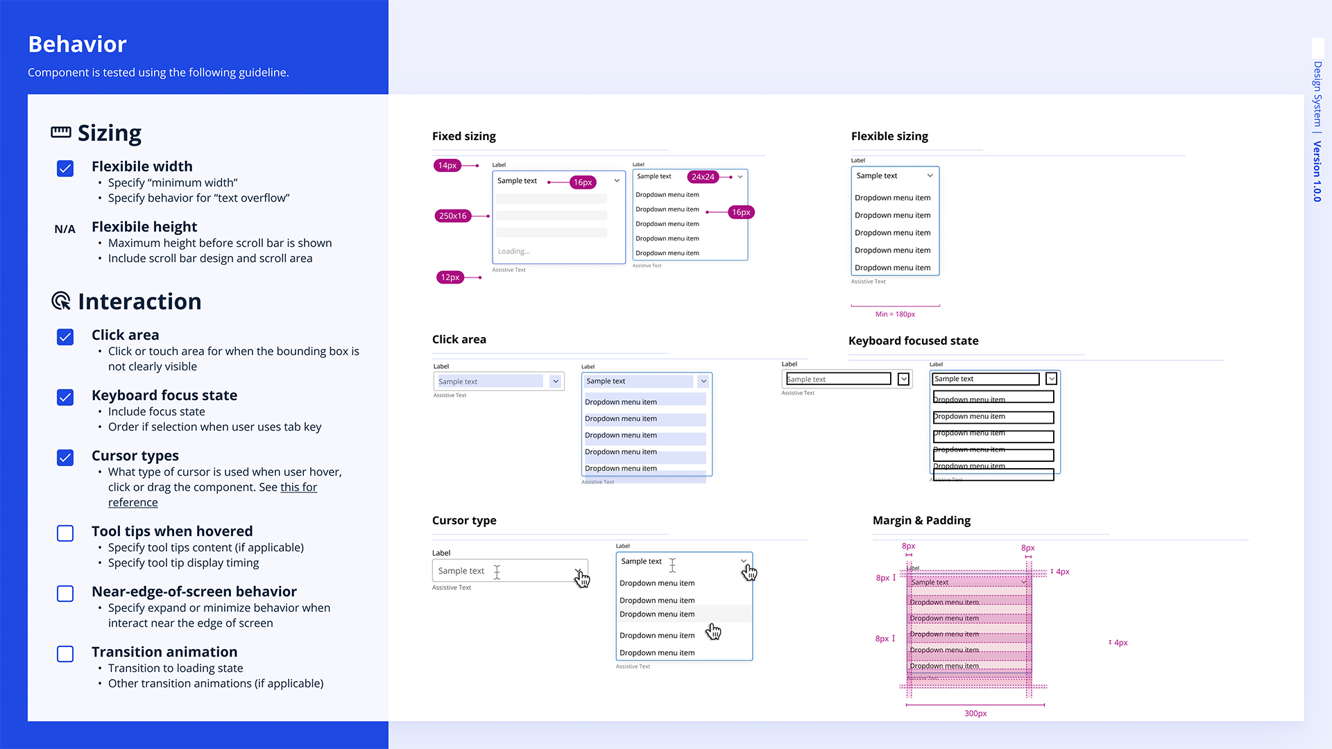
The component’s behavior includes flexible width, fixed sizing, clear click areas, and focus states for keyboard navigation. It adjusts cursor types during interactions, shows tooltips on hover, and manages screen-edge behavior with expand/minimize options. Transition animations are also applied as needed.
Anatomy and Component-specific tokens
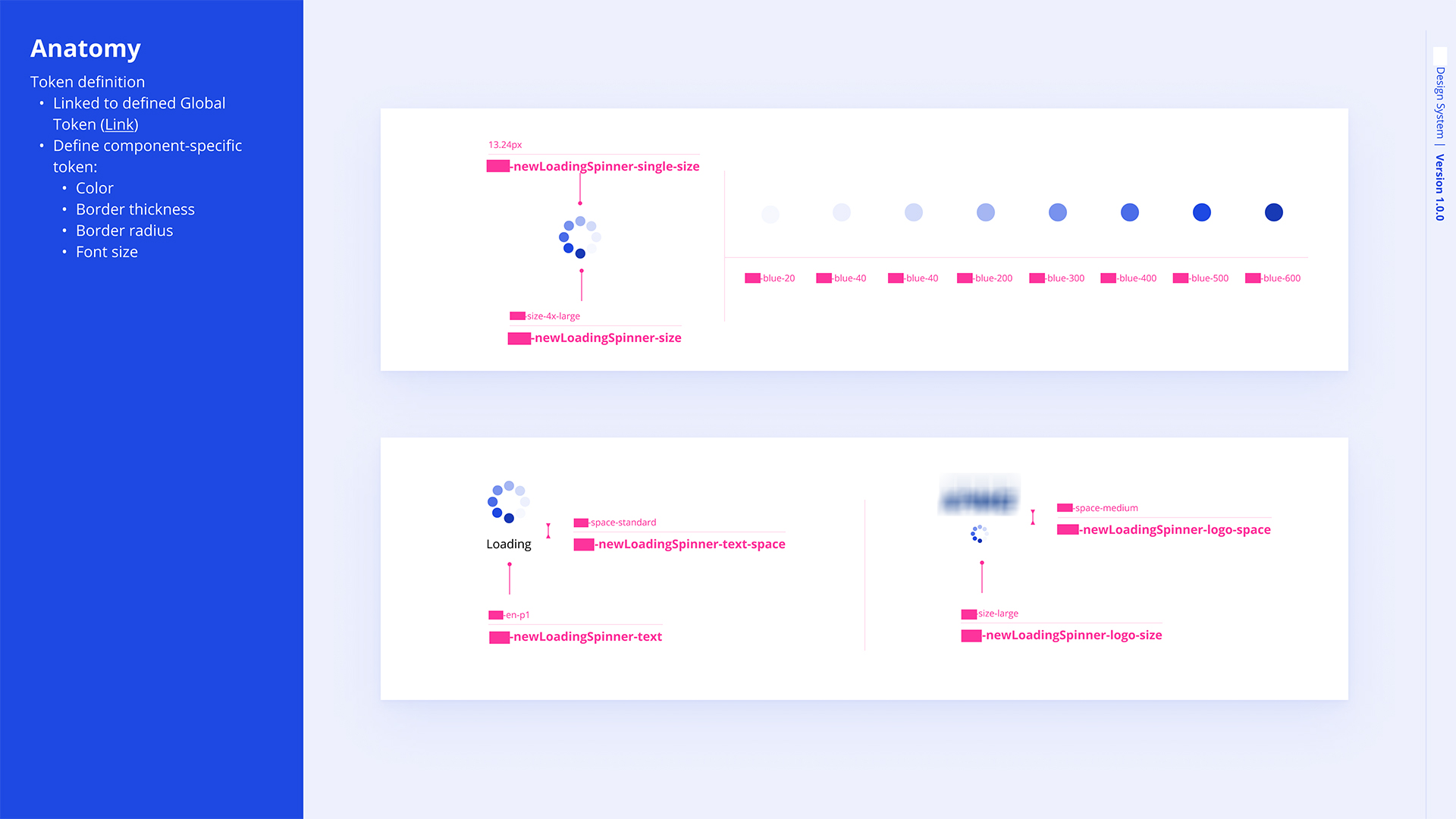
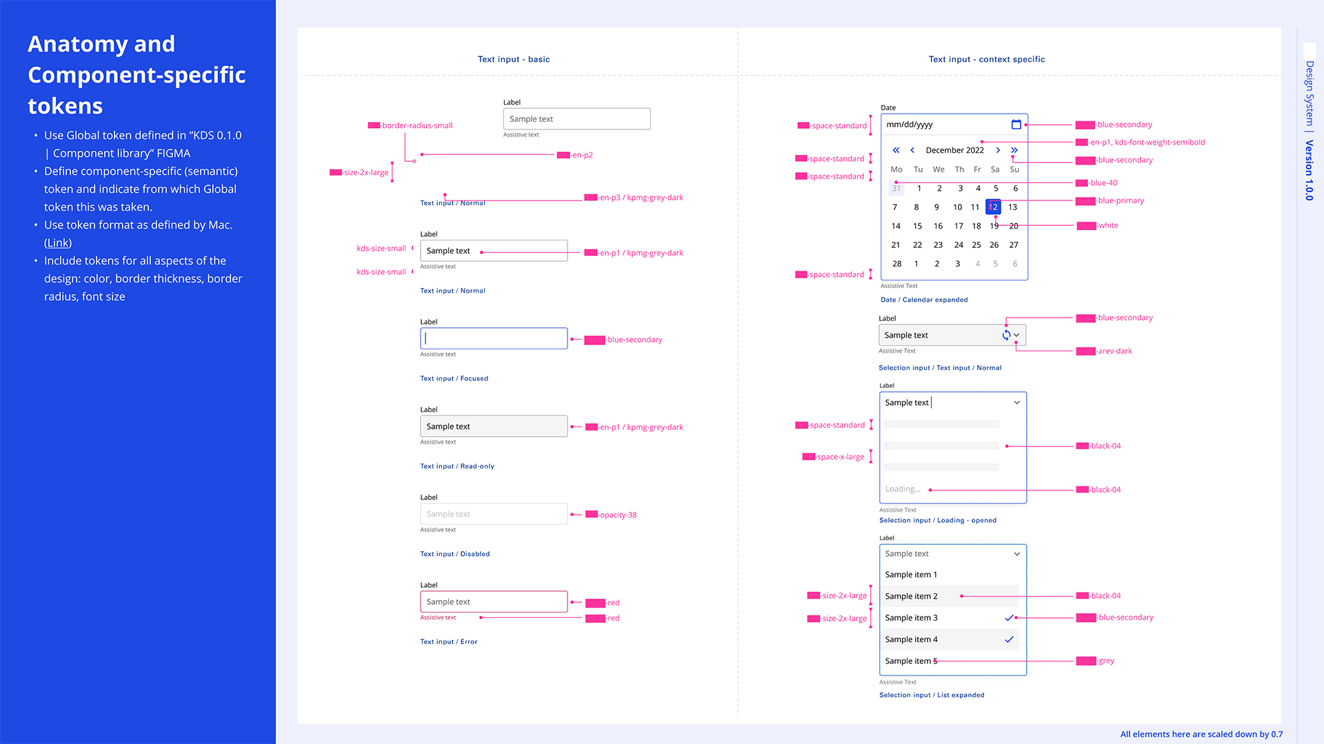
Component-specific tokens are unique values assigned to individual components to define their appearance and behavior. These tokens are derived from global tokens but are tailored to suit the specific needs of each component, ensuring consistency and flexibility. They control attributes like color, border thickness, border radius, font size, and spacing.
Information visualization (chart & graph)
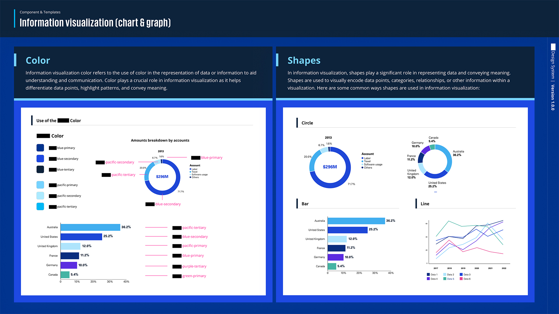
The information visualization part highlights the use of color and shapes in data visualization. Color helps differentiate data points, using primary brand colors to represent categories and regions. Shapes like circles, bars, and lines are used for proportions, comparisons, and trends. Together, they create clear and effective visualizations for better data understanding.
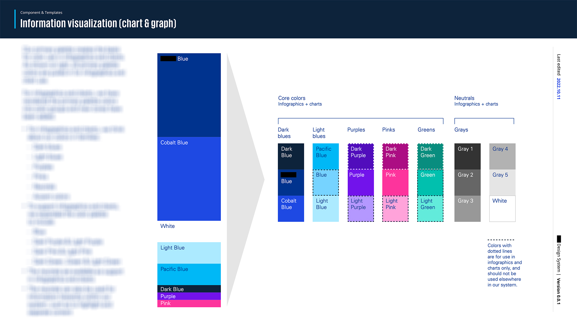
The slide shows a color palette for infographics and charts, with dark blues, light blues, purples, pinks, greens, and neutrals. Key colors include different shades of blue, purple, pink, green, and gray. Dotted colors are used only in charts, and neutral tones help highlight and separate content, ensuring a clear and consistent visual style.
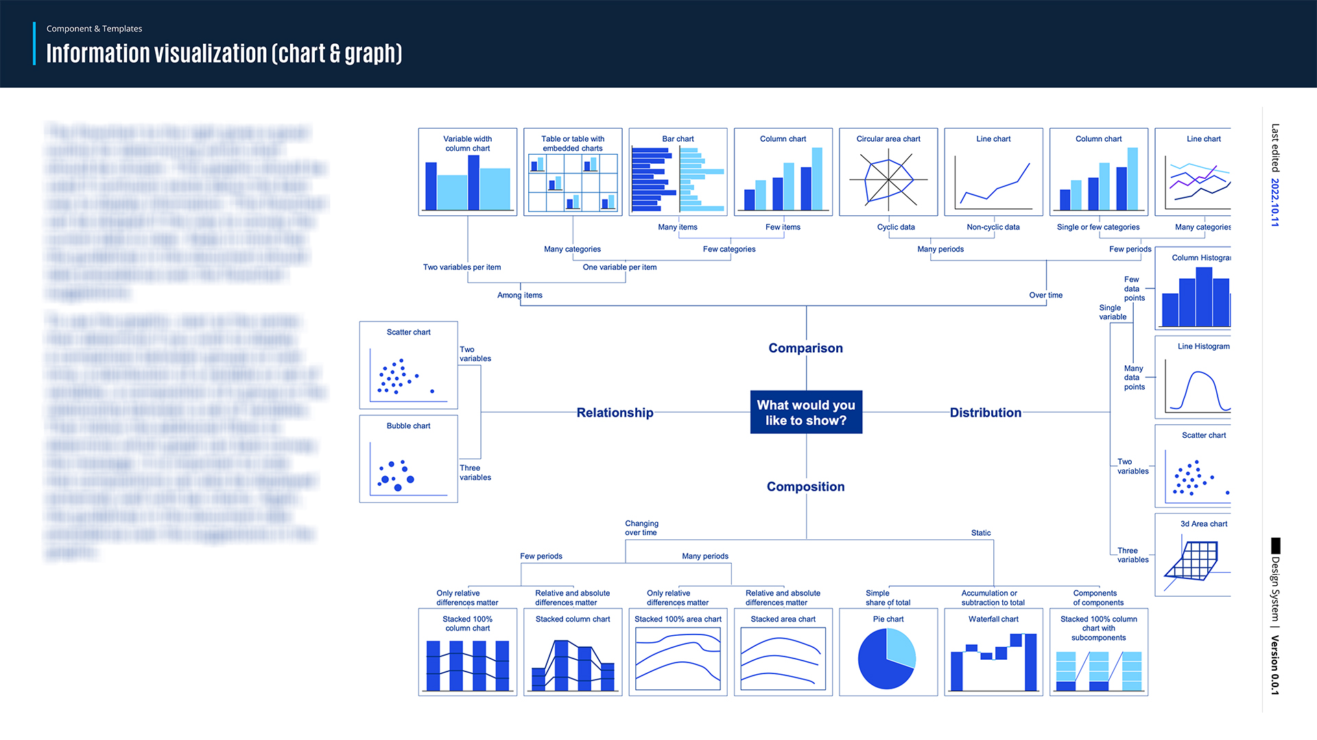
Depending on your data type, such as the number of variables, items, categories, or time periods, the flowchart suggests different chart types like bar charts, column charts, scatter charts, line charts, pie charts, and more. The guidelines in the document take precedence over the flowchart, and it’s useful when deciding between various data visualization options.
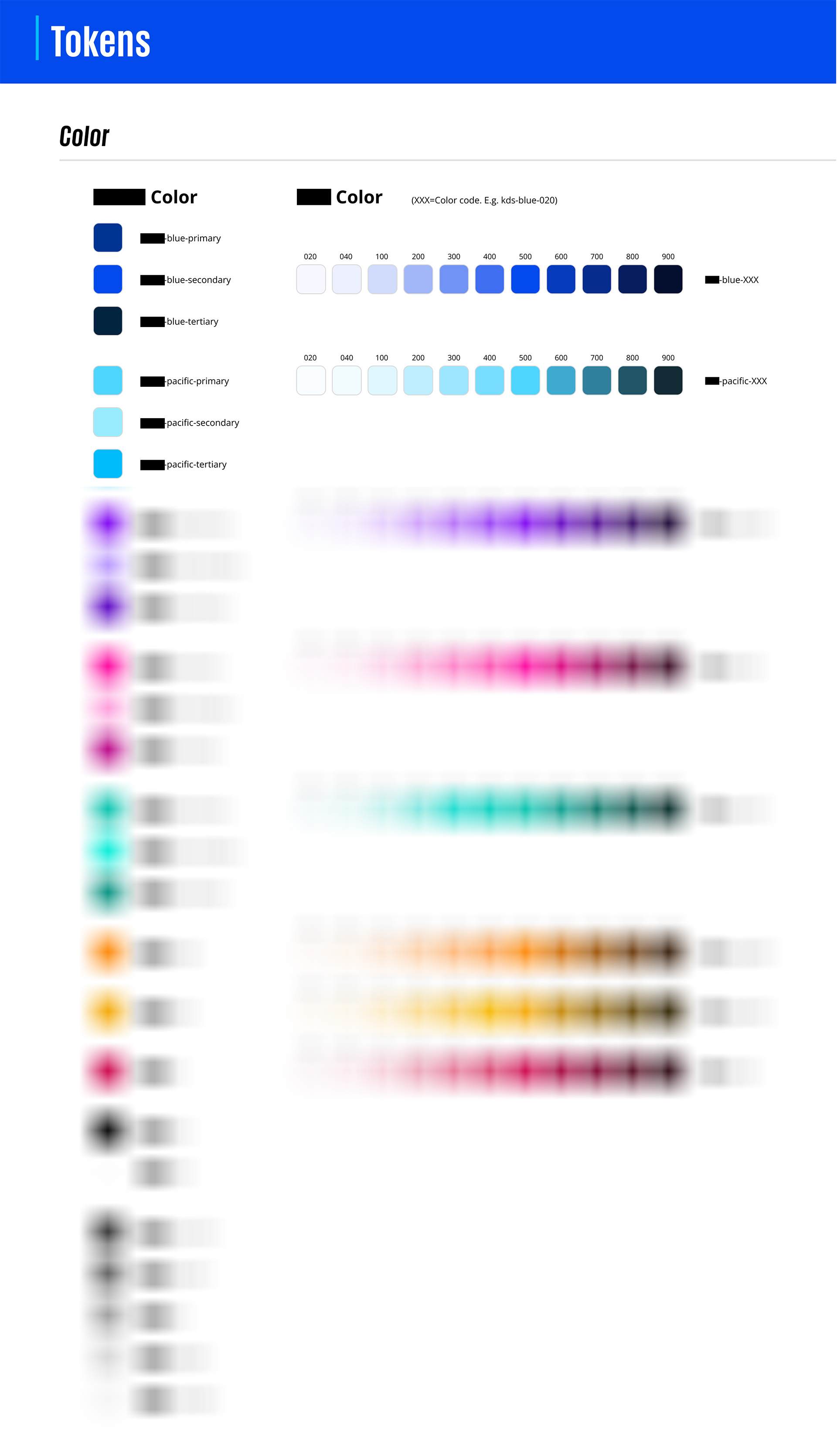
The color token system is categorized by primary, secondary, and tertiary shades for each color family, including blue, pacific, purple, pink, green, orange, yellow, red, black, white, and various grays. Each color is represented with multiple shades, marked by codes ranging from light (Q20) to dark (Q900). These colors correspond to the brand guidelines and have passed usability tests according to W3C color compliance, ensuring accessibility and readability across platforms.
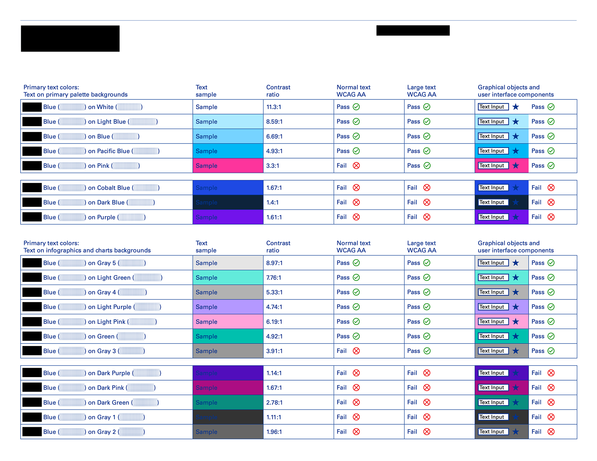
We have always considered usability while designing components; all the elements, including color tokens, in the KIT design system have passed text W3C color compliance. We have also conducted other examinations, such as contact and readability tests for text-related components on the second version of the design system demo.